I haven't updated this blog with design processes for a while, sorry about that. But I need to be in the right mood to sit down and type plenty of paragraphs in English. One of the topics that are most important to me in design process is composition & layouting.
I don't claim I am an expert on it. I also cannot use any fancy terminology and the stuff I learned in high school art class is long gone. All I tell you now is from my own experience, from a few good books and I haven't invented any of it. I just found out what works well for me, and I still screw composition up, even though I think I should know better by now.
let's start with my most favorite source on composition: It's Hans Bacher's book "Dreamworlds". My favorite art book blog wrote a pretty good review of it, which you can find here.
 Not a single other books has helped me more to improve on composition as this books has. Hans Bacher worked in concept art for Disney and did absolutely stunning artwork for most of the Disney movies starting from "The Beauty and the Beast". His approach comes from film and animation, but that doesn't matter. Everything he says can be applied to any style of illustration and any field. It's especially useful in my work in the comic field.
(all images below by Hans Bacher)
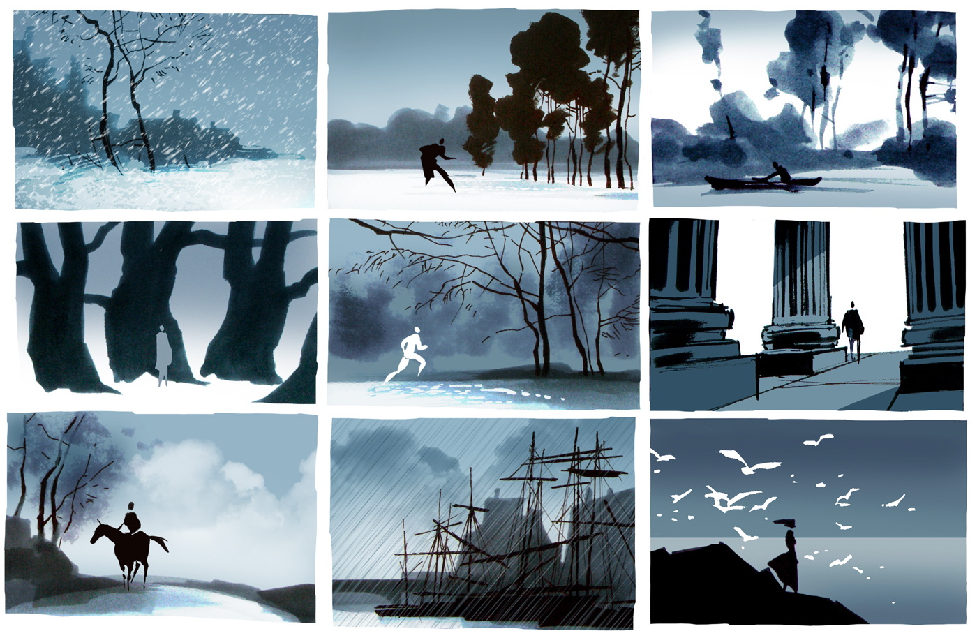 In his book he tells us about the various way to build a scene by object/figure placement. By varying sizes, shades, tones, colors. By finding a design "rhythm", making the lines dance with each other. I haven't grasped the full potential of this book yet, but I am trying and I keep on looking into it over and over again.
Now, how do I build a composition
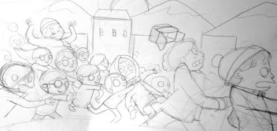
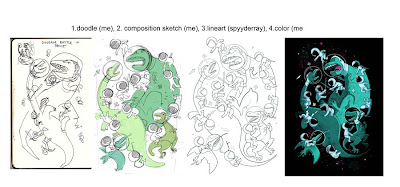
If I find myself patient enough, I will take the time to create various rough doodles before I start the actual drawing. As a crazy impatient person, I don't always do it and sometimes I just dive right into a drawing, which usually results in something that could be far better. I almost always start with a very rough doodle. The doodle just consists of shapes, and maybe some very stylized faces, but basically I try to find out what the relationship of my shapes is in this picture.
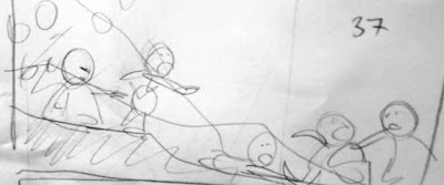 This is my South Park fan piece, which I re-doodled about 10 times before I liked it. I never conisder my pencils very good, I feel none of my pieces are complete until I digitally color them. But with the doodle above, I found out if the image worked as a whole. I basically completely depend on this doodles, especially with a complicated illustration.
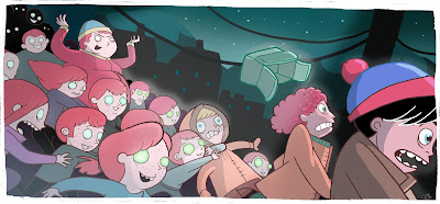
This is the end result:
When I do shirts, I ALWAYS do a doodle first. It's basically impossible to NOT do them, I would feel...lost. As you find in the example below, this is especially important for collaborations (this one I did with Rebekie Bennington.
 I recently started to use Photoshop and my Wacom to do digital layouts before the actual pencils. Let's go trough that step by step by looking at one of the comic pages for the project I am working on with Rebekie and Daniel:
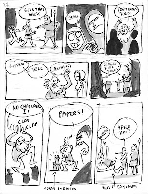
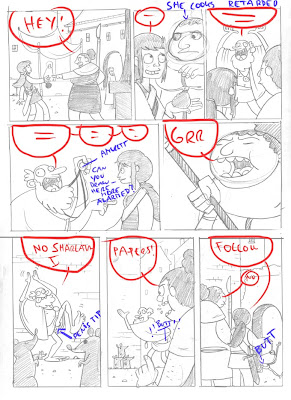
Step 01, the storyboard:
After reading Dan's script, I turn his descriptions and words into images. This step requires me to do a storyboard, which is nothing else but a series of mini-layouts next to each other. In comics, not only the layout of the image itself counts, but the layout of the panels in relationship to each other is important as well.
In this storyboard, I find out where bubble space will be, which panels have a background and which ones don't, I try to find a variation of perspectives and I try to find a narrative flow between the panels.
 Step 02, the digital layout:
This is something I have just found out as a perfect tool for myself. I design a digital layout in Photoshop which looks roughly like this:
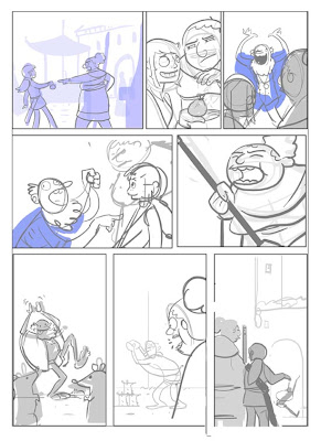 This is so incredibly helpful because I don't torture myself getting the same results by destroying one piece of paper after each other by erasing the shit out of it and by getting more and more frustrated because I don't get a perspective/vanishing point, etc. The digital layouting enables me to fool around with great ease.
Step 03, pencil on lightbox
I print it out on two sheets of paper and glue them together. I then do a pencil with more details on my light box.
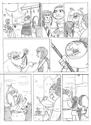 I add notes for my inker:
 And the rest is out of my hand - now, by using digital layouts, I manage to create a far cleaner pencil for my inker Rebekie. And this method you can use for ANY illustration.
Anyway. This is chapter 2 of my design process blog entries. I hope it was helpful. :-D
I don't claim I am an expert on it. I also cannot use any fancy terminology and the stuff I learned in high school art class is long gone. All I tell you now is from my own experience, from a few good books and I haven't invented any of it. I just found out what works well for me, and I still screw composition up, even though I think I should know better by now.
let's start with my most favorite source on composition: It's Hans Bacher's book "Dreamworlds". My favorite art book blog wrote a pretty good review of it, which you can find here.
Not a single other books has helped me more to improve on composition as this books has. Hans Bacher worked in concept art for Disney and did absolutely stunning artwork for most of the Disney movies starting from "The Beauty and the Beast". His approach comes from film and animation, but that doesn't matter. Everything he says can be applied to any style of illustration and any field. It's especially useful in my work in the comic field.(all images below by Hans Bacher)
In his book he tells us about the various way to build a scene by object/figure placement. By varying sizes, shades, tones, colors. By finding a design "rhythm", making the lines dance with each other. I haven't grasped the full potential of this book yet, but I am trying and I keep on looking into it over and over again.Now, how do I build a composition
If I find myself patient enough, I will take the time to create various rough doodles before I start the actual drawing. As a crazy impatient person, I don't always do it and sometimes I just dive right into a drawing, which usually results in something that could be far better. I almost always start with a very rough doodle. The doodle just consists of shapes, and maybe some very stylized faces, but basically I try to find out what the relationship of my shapes is in this picture.
 This is my South Park fan piece, which I re-doodled about 10 times before I liked it. I never conisder my pencils very good, I feel none of my pieces are complete until I digitally color them. But with the doodle above, I found out if the image worked as a whole. I basically completely depend on this doodles, especially with a complicated illustration.
This is the end result:

When I do shirts, I ALWAYS do a doodle first. It's basically impossible to NOT do them, I would feel...lost. As you find in the example below, this is especially important for collaborations (this one I did with Rebekie Bennington.
 I recently started to use Photoshop and my Wacom to do digital layouts before the actual pencils. Let's go trough that step by step by looking at one of the comic pages for the project I am working on with Rebekie and Daniel:
Step 01, the storyboard:
After reading Dan's script, I turn his descriptions and words into images. This step requires me to do a storyboard, which is nothing else but a series of mini-layouts next to each other. In comics, not only the layout of the image itself counts, but the layout of the panels in relationship to each other is important as well.
In this storyboard, I find out where bubble space will be, which panels have a background and which ones don't, I try to find a variation of perspectives and I try to find a narrative flow between the panels.
 Step 02, the digital layout:
This is something I have just found out as a perfect tool for myself. I design a digital layout in Photoshop which looks roughly like this:
 This is so incredibly helpful because I don't torture myself getting the same results by destroying one piece of paper after each other by erasing the shit out of it and by getting more and more frustrated because I don't get a perspective/vanishing point, etc. The digital layouting enables me to fool around with great ease.
Step 03, pencil on lightbox
I print it out on two sheets of paper and glue them together. I then do a pencil with more details on my light box.
 I add notes for my inker:
 And the rest is out of my hand - now, by using digital layouts, I manage to create a far cleaner pencil for my inker Rebekie. And this method you can use for ANY illustration.
Anyway. This is chapter 2 of my design process blog entries. I hope it was helpful. :-D
Digital Layouting
1 comment:
Butt Exposure :)
Post a Comment